Prototypes
Working demos of ideas I'm building — runnable in the browser, no install.
Collapsed maps diagram
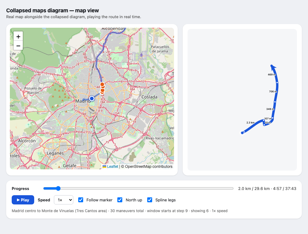
Click the image or the title to open the live demo — a real Madrid route (OpenStreetMap, rendered with the Leaflet library) playing at driving speed (1×) or accelerated (10× / 60×), with a progress slider and toggles.
A navigation overlay that shows the next few maneuvers as one clear diagram. Distances are log-compressed so three turns within 100 m and a 10 km highway leg fit on the same screen, but every drawn angle stays exactly what you see through the windscreen — lengths are the one thing the diagram distorts, angles never. Legs are splines whose end directions follow the real road bearings, the view keeps north pointing up so the picture never rotates under you, and maneuvers turn red as you approach them.
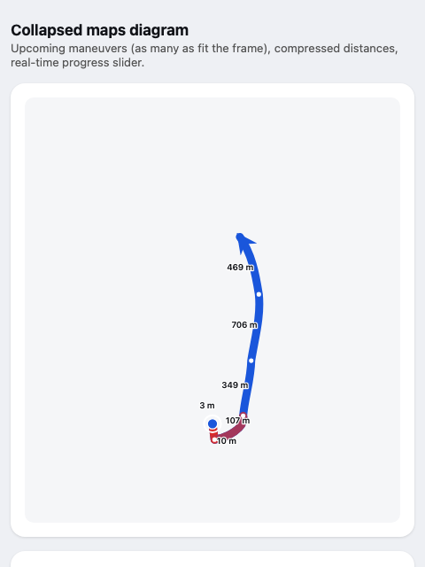
Typical navigation apps show one upcoming maneuver at a time; this shows the shape of what's coming — most useful when several exits or turns arrive in quick succession, like the red cluster above.
The route is a fixed test route (Madrid centro → Monte de Viñuelas, 29.6 km), fetched from OSRM (Open Source Routing Machine, a free routing engine); progress is simulated with a slider or clock, not GPS. Prior art for the length distortion: LineDrive (Agrawala & Stolte, SIGGRAPH 2001), which showed that non-uniform route scaling reads well — the sliding real-time window over upcoming maneuvers is the part that's new here.
Car pie menu
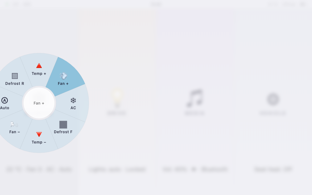
Click the image or the title to open the live demo — best on a tablet in landscape, added to the home screen for fullscreen.
Car touchscreens are uncomfortable while driving because small buttons need visual feedback, and your eyes are already busy. This prototype replaces them with pie menus, the interaction Blender users know: touch anywhere in a broad region (climate, drive, media, vehicle) and the options appear in a circle around your finger — you select by dragging in a direction and releasing, no precision needed and no need to look at where you first touched. Options are always visible, so there's nothing to memorize up front, but once you know the directions you can operate entirely by muscle memory.
Visual variants of the same idea: columns, glass, HUD.
Small utilities
- Offline screen ruler — a self-contained centimetre, inch, and pixel ruler with card calibration, edge rulers, and guide lines; it keeps working from the checked-out HTML file without a network connection.
- Solar pump calculator — an old quick calculator (Spanish UI): electricity cost of running a pump over the years vs. the cost of the solar panels to power it instead.